First step, laying out the HTML structure:
<nav>
<ul class="top-nav">
<li><a href="#">Home</a></li>
<li><a href="#">About</a>
<ul class="sub-nav">
<li><a href="#">First</a></li>
<li><a href="#">Second</a></li>
<li><a href="#">Third</a></li>
<li><a href="#">Fourth</a></li>
</ul>
</li>
<li><a href="#">Projects</a>
<ul class="sub-nav">
<li>a href="#">Project 1</a>
<ul class="sub-nav1">
<li><a href="#">Project 1.1</a></li>
<li><a href="#">Project 1.2</a></li>
<li><a href="#">Project 1.3</a></li>
<li><a href="#">Project 1.4</a></li>
</ul>
</li>
<li>a href="#">Project 2</a>
<ul class="sub-nav1">
<li><a href="#">Project 2.1</a></li>
<li><a href="#">Project 2.2</a></li>
<li><a href="#">Project 2.3</a></li>
<li><a href="#">Project 2.4</a></li>
</ul>
</li>
<li><a href="#">Project 3</a></li>
<li><a href="#">Project 4</a></li>
</ul>
</li>
<li><a href="#">Contact Us</a></li>
</ul>
</nav>
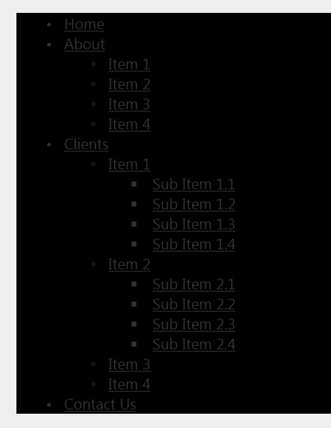
Here is what the structure looks like with no CSS applied:
Now to start applying some style. I will include some screenshots so we can see how the menu starts to take shape.
First thing we are going to do is set the color for the background, black:
nav {
   margin-top: 20px;
   background: black;
}
Let's add some color to the hyperlinks.
a:link {
   color: silver;
}
The next block of css will be going after all of the list items in the top-nav class.
.top-nav > li {
   display: inline-block;
   width: 20%;
   position: relative;
}
Next we will go after all the anchor elements in the list items of the top-nav class.
.top-nav > li a {
   text-decoration: none;
   font-size: 24px;
   line-height: 1.5em;
   text-align: center;
   display: block;
}
Text-decoration: none removed all the underlines of the anchor elements as well as the bullets. Line-height will center the text vertically. Text-align: center will center the text horizontally. Display: block will render the anchors as block level elements.
Next will be some css that targets hovering over the anchor items for the top-nav, sub-nav, and sub-nav1 classes. The text will simply turn red (look at the Clients tab) and the background of the fly out items (all the Sub Items) will be set to black.
.top-nav > li > a:hover,
.sub-nav > li > a:hover,
.sub-nav1 > li > a:hover {
   color: red;
   background: black;
}
Things will start to take shape with the next block of css. We will target all the sub-lists. The screenshot will not show much due to the sub-lists being hidden.
.sub-nav {
   position: absolute;
   width: 100%;
   visibility: hidden;
   padding-left: 0;
   padding-right: 0;
   margin-left: 0;
   margin-right: 0;
}
Definitely an improvement, starting to look like a proper navigation menu. Visibility: hidden is obviously hiding the lists. Earlier I mentioned that by default a browser will indent lists by 40px, setting the padding and margin to 0 for left will correct that. Setting the width to 100% will make the sub-items the same with as the parent list items. Very, very important...position: absolute will position the ul items directly under the list items. For example, the ul items First, Second, Third, and Fourth will be placed directly under the About item.
We have content that is hidden, let's start showing it. The css below will show sub-nav content when list items of the top-nav class are hovered.
.top-nav li:hover .sub-nav {
   visibility: visible;
}
We have some color and positioning to take care. The next css block will target the list items of the sub-nav class. This code will align the list items nicely and set up the fly out items.
.sub-nav > li {
   display: block;
   width: 100%;
   position: relative;
   background: black;
}
Boom! Look at that, all nice and pretty. Display: block renders each item as a block. Setting the width to 100% will size it to the parent. Setting position to relative is what will assist in the fly out items. And of course, setting the background to black will set the background of the list items to black.
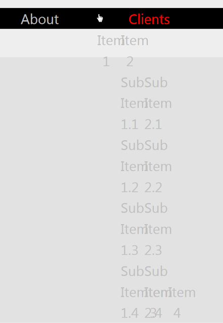
The Clients tab is still a mess. The .sub-nav > li code did help line things up. Let's take a look at it.
The Item1-4 tabs are lined up. The css block below will assist in hiding and positioning the nested items.
.sub-nav1 {
   position: absolute;
   width: 100%;
   visibility: hidden;
   padding-left: 0;
   padding-right: 0;
   margin-left: 0;
   margin-right: 0;
}
The sub-items that will fly out to the right are hidden. Width is set to 100% will size to the parent so things line up. Again, setting the padding and margin left and right will remove the 40px the browser inserts for list items.
Remember the .sub-nav > li css code? It has position: relative set. This is extremely important for the flyouts. The .sub-nav1 code has position set to absolute. The parent is relative and the child is absolute. This limits positioning. An child of a relative parent can be positioned absolutely within that block. Basically, if relative positioning was not set on the parent, setting the child to absolute would cause a drastic change in position, it would not end up where we want it to be. (My head still hurts from that)
Since we are at the meat of the issue, let's break this next part down line by line so we get a really good idea of what is going on. We will hover over the Item 2 list item and make it visible.
.sub-nav li:hover .sub-nav1 {
   visibility: visible;
}
Obviously the positioning is incorrect. If you hover over Item 1 you will not see the sub-items at all, since they are being covered by the black background.
We need to get all the sub-items moved over to the right. To do this, add left: 100%. This will push the items over to the right.
.sub-nav li:hover .sub-nav1 {
   visibility: visible;
   left: 100%;
}
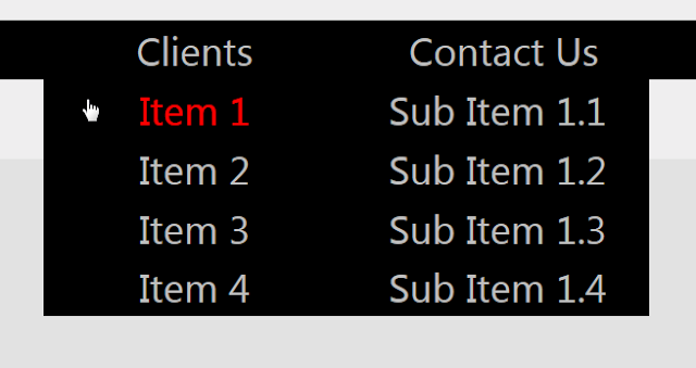
Very nice. The fly out list items are one level down from where we want them to be, we have to move them up. To accomplish this, set top to 0%.
.sub-nav li:hover .sub-nav1 {
   visibility: visible;
   left: 100%;
   top: 0%;
   position: absolute;
}
Looking good! All that remains is to style the list items that are flying out, those are in the .sub-nav1 class. As we have seen many times, set the width to 100% so it is the same size as its parent, and display the list items as blocks. Lastly, set the background to black.
.sub-nav1 > li {
   display: block;
   width: 100%;
   background: black;
}
Once you get this far, it's just a pattern now. You could keep on building the navigation menu out to whatever you need.


